Tuesday, June 11, 2024

Evidence Of evidence and development video

Video

First I added all of my raw footage and chose the clips I wanted to use for my video, the next step was to place these clips in the order I wanted and cut out any footage which was unnecessary or I just didn't want to feature.


Second of all I added my sourced music to my project, this helped to add an atmosphere to my video. I adjusted the sound level of the music according to my clips original audio so that they worked in harmony instead of one being overpowering.

I added text intermittently throughout my project not only just for context but also to inform and educate through the recruitment video, I edit my text via the text properties tab, this including things such as text size and colour but I also sourced a custom font so it was more fitting with the conventions of the fire service. In the bottom left of my second screenshot you can also see the Derbyshire fire and rescue logo which I added as it looks more professional whilst also almost acting like a credit to the service.

On a few of my clips I used the speed and duration effect, this was necessary in order to match up events that are happening on screen with the music. Also some of my clips were just filmed to slow compared to the pace I wanted to achieve for more dramatic effect.

In the last part of my video the text 'Join and save lives' appears from behind the fire fighter which was very difficult to do however I think this small change really adds to the video. I managed to achieve this effect by tracing the movement of the man with the pen tool and other techniques and inverting my selected area so that the text would only appear once his body had passed a certain point on the screen.


Evidence of editing and development web banner

 Web Banner

To begin with I created a new project with the correct resolution of a web banner, I them laid out the foundation for how I wanted it to look by adding boxes and shadows where images and graphics were going to be located on the banner.


Secondly I added the triangular graphics on the side and edited the colours until I was happy with the result, I decided on a dark orange for the back as I think its a solid foundation colour to build off of and I felt orange colours would relate and fit the conventions of the fire service.

Finally I inserted my own images and created a clipping mask so that they would fit into the boxes I created prior, creating the boxes for them to go in before hand also meant I was able to create a small white border around each image. I added the text 'Derbyshire Fire & Rescue' simply because they are my client and customised the text with a custom sourced font. The last graphic I added in order to fill out the web banner a bit more and make it interesting was a PNG image of fire to catch the viewers eyes a bit more.


Monday, June 10, 2024

Evidence of editing and development poster

Poster


I started my poster prior to taking my own images so sourced the ones you can see from the internet just so I could gain a insight into what my poster may look like with my own image included, the white bars you can see where intended to contain information about the fore service etc. They all doubled as looking like a ladder which is commonly associated with the fire service.


Next I added the information into the white bars, the numbers are the number to contact Derbyshire fire and rescue and on the left is a statement/rhetorical question asking 'Do You Have What It Takes?" which I feel evokes the audience to try and prove themselves. Finally I added the Derbyshire fire & rescue logo in the top right just as a graphic which fits with the magazine conventions.


After taking my own photos I picked this specific one from my shoot, I used this as its simple clear and clearly associated with the fire service, I slightly increased the brightness and contrast to hopefully make it pop out a bit more than before.


To finish my Poster off I adde my own image along side the fire and created a rough edge look between each image to almost portray either side of the battle. The last part of the poster I added was a statement "Join the team" and the sub writing which makes the audience feel as so they can join a service who work together to save livesI felt was very important and brought it all together, the final bit was the link to the Derbyshire fire service website so they could read up further information.


Sunday, June 9, 2024

Gaining feedback

 Recruitment Video


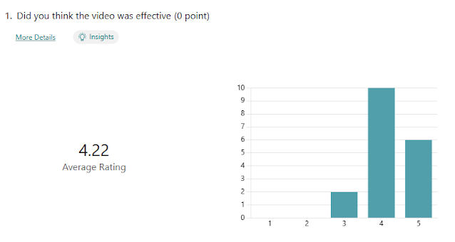
I collected 18 responses for my recruitment video and I think the feedback was generally very positive. The question regarding the length of the video got the lowest rating at 4.06 out of 5 however I am still pleased with  this, I understand why some people may have thought the video was too short as it was under a minute but I was aiming to create a short video that wouldn't lose the viewers interest and i feel as so I effectively did so.

Recruitment Poster


I gathered 11 responses and once again I am happy with the feedback I received in response to my poster especially since the results show it reached a varied range of ages as I intended it too, furthermore the composition of the poster got a rating of 4.18 which I feel is good and there was no ratings below a 3. Finally 70% of the people said they would either definitely view the poster or at least consider it which I'm pleased with as I don't think 100% would ever say yes no matter what the poster involved or how good it was.

Web Banner


The response for my banner was positive with an average if 4 star rating for colours and graphics as well as 12 people saying they would take the time to view the banner. There wasn't really anything i would consider negative so i am happy with the result. 

Risk Assesment


Location Reece


M3 - Codes and conventions

Codes and conventions Recruitment Video: Here you can see my video fits the codes and conventions of a similar recruitment video a they shar...